Mapping the Link between Life Expectancy and Educational Opportunity

Teens in neighborhoods with high levels of educational opportunity have longer life expectancies

By: Renee Ryberg, Nadia Orfali Hall, Claire Kelley, Jessica Warren, and Kristen Harper

In the United States, the average lifespan of an adolescent varies widely by neighborhood.

In 2015, an average 15-year-old could expect to live to age 79. However, teens living in the 1 percent of neighborhoods with the lowest life expectancies could expect to live to 70—a lifespan nine years shorter.

Educational attainment, a key social determinant of health, is one of the most powerful predictors of life expectancy. This association has strengthened over the past 20 years, placing our nation’s schools at the forefront of initiatives to improve teen health outcomes and reduce health disparities.

Measures of educational attainment, however, provide state and local officials with little actionable information to guide their efforts. To effect change, officials need data that both identify the factors that influence educational attainment and illustrate the educational experiences schools provide.

Measuring educational opportunity, or the contexts and resources available to support educational success, may provide more actionable points of intervention. As with adolescent life expectancy, educational opportunity is not distributed equitably. Communities with high concentrations of people living in poverty or people of color have less access to experienced educators and rigorous academic content.

In this interactive tool, we examine the relationship between educational opportunity and life expectancy to provide information that education and health policymakers need to communicate how investments in education may promote teen health.

This project is based upon work supported by the Urban Institute through funds provided by the Robert Wood Johnson Foundation. We thank them for their support but acknowledge that the findings and conclusions presented in this report are those of the authors alone, and do not necessarily reflect the opinions of the Urban Institute or the Robert Wood Johnson Foundation.

Measuring educational opportunity

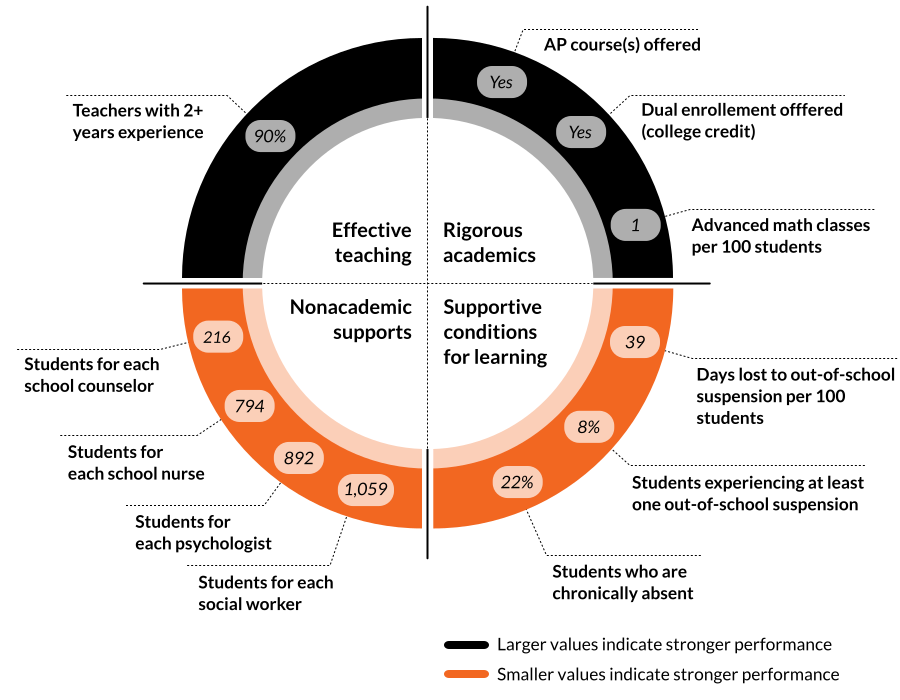
We used four domains of educational opportunity, inspired by a 2019 report from the National Academies of Sciences, Engineering, and Medicine, to capture students’ high school experiences. Each high school was assigned an educational opportunity score based on the indicators in these domains: 1) effective teaching, 2) rigorous academics, 3) nonacademic supports, and 4) supportive conditions for learning. Scores were then divided into five evenly sized groups (quintiles) from low to high levels of educational opportunity. We defined educational opportunity for each neighborhood (i.e., census tract) based on the score(s) of the nearest high school(s) in the school district. The figure below shows what educational opportunity looks like in a neighborhood with access to average levels of educational opportunity (i.e., the average school in the middle quintile).

The four domains of educational opportunity

Values are for the “average neighborhood”

Examining the association between neighborhood educational opportunity and life expectancy

We found that educational opportunity explains a small, but meaningful, amount of the difference in life expectancy between neighborhoods. Educational opportunity explains about 6 percent of this difference. Meanwhile, a neighborhood’s demographic characteristics, including the percentage of residents living in poverty and their racial and ethnic composition, contribute much more to life expectancy. Although the contribution of educational opportunity to life expectancy is smaller than the contributions of systemic inequities associated with race, ethnicity, and poverty, educational opportunity is an actionable point of intervention to improve life expectancy and diminish disparities between neighborhoods. Educational opportunity can be improved by focusing on any or all of the four domains: effective teaching, rigorous academics, nonacademic supports, and supportive conditions for learning.

We offer one cautionary note: While we found a relationship between educational opportunity and life expectancy, we have not explored or established a causal link. Each local community has contextual factors beyond simple demographic characteristics that may influence the association between educational opportunity and life expectancy.

The plot below offers a look at this trend from a national perspective.

Neighborhoods with more educational opportunity tend to have longer life expectancies for adolescents.

Scroll
for
more

Each dot on this plot represents a group of neighborhoods. Larger dots represent more neighborhoods. Neighborhoods farther to the right on the graph have access to higher levels of educational opportunity. Neighborhoods higher up on the plot have longer life expectancies for 15-year-old youth. The orange line shows the relationship between educational opportunity and youth life expectancy after considering neighborhood characteristics. Scroll for more.

Educational opportunity and life expectancy in your community

Educational decision making largely occurs at local and regional levels, within schools, districts, and states. The following map provides raw data on educational opportunity and life expectancy to illustrate communities with overlapping education and health advantages and disadvantages.

The relationship between neighborhood educational opportunity and life expectancy relies on the assumption that teens attend school in their own neighborhoods. In some locations, large school choice programs may disrupt the association between educational opportunity and life expectancy. At the national level, though, our model showed similar results with the inclusion of charter schools.

Communities with both short life expectancy and low educational opportunity—particularly those communities with concentrated poverty—often experience coexisting disadvantages that are rooted in long-standing systems of inequity and discrimination. Many neighborhoods still mirror the racial and income divisions that were codified in the redlining maps drawn by the Home Ownership Loan Corporation. While school segregation and housing discrimination were outlawed in 1954 and 1968, respectively, many neighborhoods and schools are still segregated due to years of racial covenants, redlining, predatory loaning, and violence. Schools serving high proportions of Black or Hispanic students, or students from families with low incomes, remain systemically under-resourced.

The map below overlays educational opportunity in high schools with neighborhood adolescent life expectancy. The “jump to city” feature includes a list of geographic anchors to allow users to easily navigate to different regions of the country. As policymakers work to address longstanding inequities, they can use this tool to explore how improving educational opportunity in their neighborhoods may positively influence the health of children and youth.

Mapping life expectancy and access to educational opportunity in U.S. neighborhoods

?

X

CITY IN-DEPTH

Baltimore City’s population peaked in the early 1950s, but suburbanization and deindustrialization have since led to steady population decline. The Great Migration and White flight shifted the city’s racial demographics from majority-White to majority-Black by the mid-1970s. Baltimore City schools began desegregating in 1956, but these efforts have been dampened by persistent neighborhood segregation.

In 1950, Detroit was the fifth-largest U.S. city, and its economy relied heavily on the auto industry. In the latter half of the 20th century, relocation of automobile factories to the suburbs, and eventually overseas, led to population decline and unemployment. Housing and employment discrimination have contributed to persistent residential segregation. Detroit has been a majority-Black city since the 1970s; currently, nearly 80 percent of residents are Black. Over one third of Detroit residents live below the poverty line. Detroit public school enrollment has fallen and over half of students now attend charter schools, which may be outside of their neighborhoods.

Washington DC was the nation’s first city with a majority-Black population. Until 1948, the Supreme Court allowed lower courts to enforce racial covenants that prevented Black families from buying properties in White neighborhoods. In the 1950s, urban renewal in DC’s Southwest quadrant displaced thousands of Black residents and businesses. Many moved to the far Southeast quadrant, where large areas were rezoned for rental apartments and public housing. After the enactment of the 1968 Fair Housing Act and the riots sparked by the assassination of Martin Luther King, Jr., many Black families left DC for the suburbs. Washington’s population has been increasing recently, but much of this growth has been in middle- and upper-class neighborhoods. Almost half of DC students attend charter schools, which may be outside of their neighborhoods.

Los Angeles is the second-largest city in the United States. From 1942 to 1964, the Bracero program brought millions of people from Mexico to work on farms and railroads in California. Due to redlining, restrictive covenants, and discrimination, most Black residents lived in South Central Los Angeles prior to the 1970s, and most Mexican residents lived in East Los Angeles. Although neighborhood segregation has decreased, this pattern remains. In Los Angeles County, nearly 1 in 4 people live in poverty.

Philadelphia’s population peaked in 1950, followed by decline until 2008. From around 1950 to 1990, the city lost many of its manufacturing jobs. At the same time, the Black and Puerto Rican population grew, while White residents moved to racially restricted suburbs. From 1990 to 2010, the city’s White population fell from 52 percent to 37 percent, while the Asian and Hispanic populations more than doubled.

Since the Great Migration, Chicago’s Black population has been concentrated in the South and West sides of the city. After World War II, urban renewal projects displaced many Black and poor Chicagoans, exacerbating severe housing shortages. Many White residents followed manufacturing jobs to the suburbs. Recently, the city’s White population has been increasing as the Black population has declined.

Neighborhood segregation in Omaha mirrors the boundaries of a Home Ownership Loan Corporation map drawn in the 1930s. Black families mainly live in North Omaha, with Latino families (largely Mexican) primarily in South Omaha and White families largely in the western suburbs. From 1975 to 1999, Omaha Public Schools (OPS) implemented government-mandated busing to comply with school desegregation, and OPS enrollment sharply declined. In 2007, Omaha adopted a learning community bill, allowing students to attend any school in 11 neighboring districts if it would improve the school’s socioeconomic diversity.

In 1928, a consulting firm proposed a city zoning plan for Austin that would segregate Black families, who lived throughout the city, into a new “Negro District” across East Avenue (now Interstate 35). Latino residents of Austin were legally classified as White but were not considered White by many residents and realtors, and faced discrimination in the private housing market as a result. To this day, most Black or Mexican Austin residents live east of I-35. The construction of I-35 and the Urban Revitalization Program further isolated East Austin by destroying housing and limiting residents’ mobility. Since 2000, East Austin has seen an increase in residents with higher incomes, as many residents with lower incomes have been displaced (i.e., gentrification).

In 1935, Atlanta built the first public housing project in the United States. Through discriminatory policies, many Black families were segregated into overcrowded neighborhoods, including public housing projects, in southern Atlanta. Subsequently, Atlanta was also the first city to receive a HOPE VI grant to demolish projects to reduce concentrated poverty. While many Black residents have recently moved to surrounding suburbs, many of the neighborhoods they live in and the schools they attend remain segregated. Since the 1970s, Atlanta has been a majority-Black city, but the majority of population and job growth has occurred in the northern part of the city and its suburbs, which remain majority-White.

In the early 1900s, many Black families from the Bahamas settled in Miami. By the 1950s, most Black residents lived in Overtown, Liberty City, Brownsville, and Opa-locka. After the Cuban Revolution, U.S. immigration policy helped many Cuban families move to Miami; these new residents primarily settled in Little Havana. In the early 1990s, Miami became a majority-Latino city. The construction of Interstate 95 and urban renewal displaced about 10,000 Overtown residents. Due to longstanding residential segregation, Miami-Dade County Public Schools remain segregated.
Jump to a city:

Show all neighborhoods where:

Explore and filter up-arrow

Neighborhood life expectancy

School educational opportunity

Back to top

Suggested citation

Ryberg, R., Orfali Hall, N., Kelley, C., Warren, J., & Harper, K. (2020, January 21). Mapping the link between life expectancy and educational opportunity. Child Trends. https://www.childtrends.org/publications/mapping-the-link-between-life-expectancy-and-educational-opportunity.

Acknowledgements

Alec Friedhoff, Emily Fulks, Tracy Gebhart, Esther Gross, Olga Morales, Stephen Russ, Deborah Temkin

New data from the United States Small-Area Life Expectancy Project (USALEEP) enabled us to examine the relationship between educational opportunity and life expectancy at the neighborhood level.

The United States Small-Area Life Expectancy Estimates Project (USALEEP) is the first public health outcome measure available nationwide at the census tract level—measuring life expectancy at birth for nearly every census tract in the country. A joint effort of The Robert Wood Johnson Foundation, National Association for Public Health Statistics and Information Systems (NAPHSIS), and the National Center for Health Statistics (NCHS) at the Centers for Disease Control (CDC), USALEEP data provide unparalleled insights into community health and demonstrate that not everyone has the same opportunity to be healthy where they live.

Newsletters